Illustration style
For illustrations, infographics and moving media
As part of the University’s graphic profile, there is a cohesive style for illustrations, infographics and animations. The style is mainly intended for moving media but can also be used in printed and digital material if photographic images are insufficient.
The illustration style is an addition to the graphic profile and is, as far as possible, to be applied when illustrations provide added value to your communication. The aim of the style is to prevent the University’s productions from deviating too much – there is considerable value in the recipient recognising the sender. And, of course, it also saves time for those producing the material.
In exceptional cases, there may need to be a departure from the style, for example in scientific and/or explanatory illustrations, diagrams and tables. Illustrations with a purely decorative purpose are always to be avoided to ensure that the University’s communication remains consistent.
For experienced designers
The style is only to be used by experienced designers and illustrators. Therefore, no templates or clip art are available. If, as an employee at Lund University, you want to use the style but do not possess design or illustrator expertise, you must always engage one of the University’s internal designers or procured external agencies. Even as a customer, it is important to know which components are included and how they are to be used. Therefore, read the guidelines below carefully before making an order. Also provide external agencies with the information on this page.
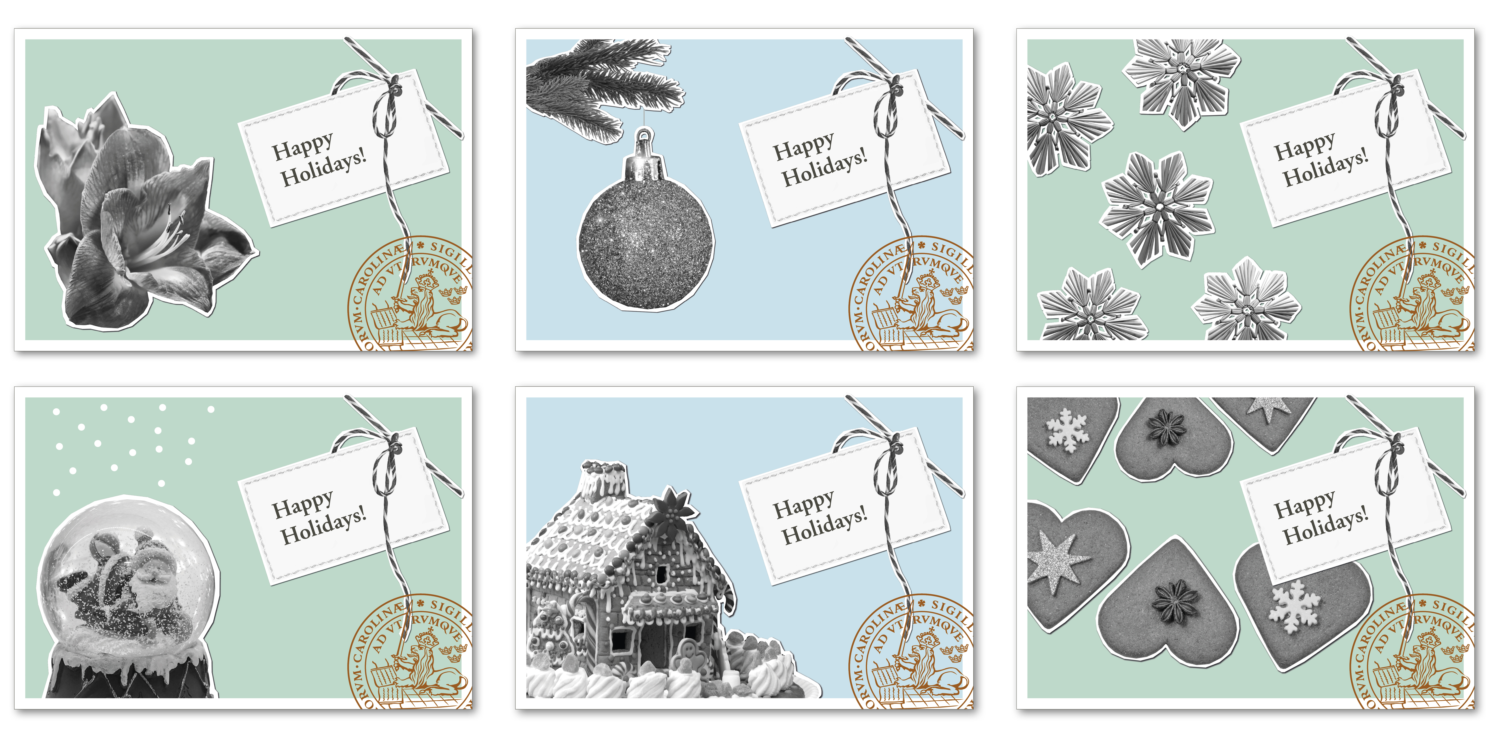
Style components and how they are to be used
The style is based on a collage technique using the following components:
- black and white clippings of copperplate and/or photographs
- geometric shapes in the University’s profile colours with or without texture
- vector lines in consistent thicknesses
- background colour in the lighter profile colours
Black and white images
The black and white photographs or copperplate images are to be clipped so that the contour of the object is retained and surrounded by a clear white edge. Only greyscale images are to be used and should have a high contrast.
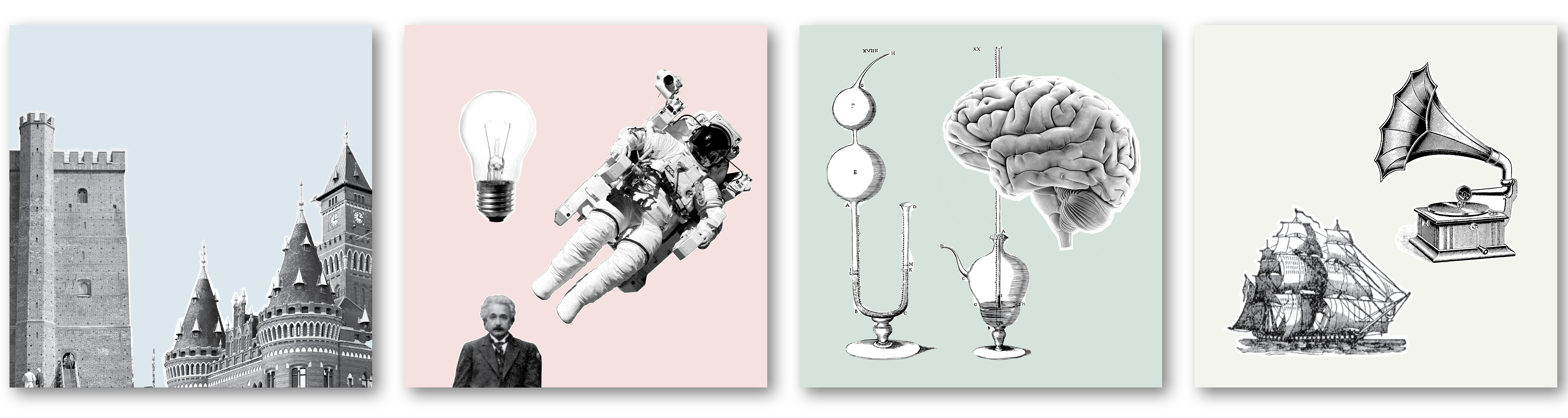
Geometric shapes
The geometric shapes are used to create dynamics and groupings in the composition. They are always to be in the University’s profile colours and can have a discreet structure to create extra depth in the image or if it links to the message of the illustration.
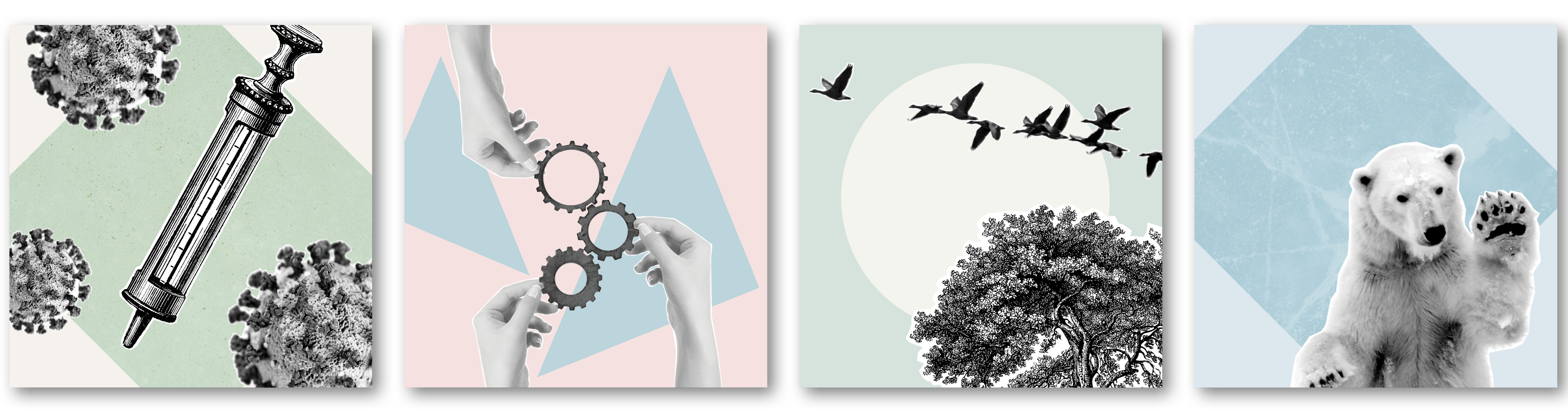
Vector lines
Vector lines can be used to convey direction or movement, or to clarify/indicate the image’s content. However, these should be used sparingly in static images, as they actually add more in moving material.
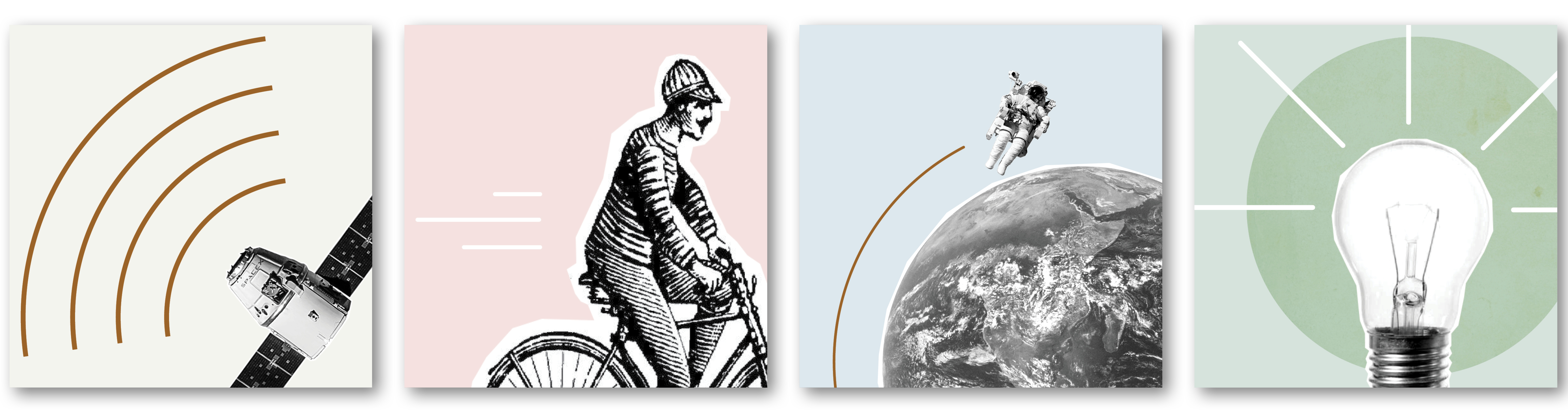
Background colours
You select the background colours from the University’s profile colours in beige, pink, light blue, green or grey. They can either be used as they are or in 50% for a lighter palette.
Examples of how the style is used in moving material
Contact
For ordering illustrations and animations, advice and price details:
illustration [at] kommunikation [dot] lu [dot] se (illustration[at]kommunikation[dot]lu[dot]se)
Catrin Jakobsson
+46 703 71 83 87
Frida Nilsson
+46 46 222 91 89
Examples of how the style is used in illustrations

Things to bear in mind if the style cannot be applied
When the illustration style cannot be used, or when creating simple graphics in the form of tables and diagrams, the productions can look different but they are always to be in line with the University’s graphic profile. Bear the following in mind:
Infographics
- The name Lund University must always be present.
- Fonts: use Lund University’s fonts Garamond and Frutiger or the alternative fonts, Times and Arial.
- The foundations of graphics are always to be based on our profile colours, but can be added to if required. As the pastel colours (pink, light blue, light green, beige and grey) are too pale to be usable in infographics when displayed on many screens/projectors, a somewhat darker colour scale has been produced, see below.
- Diagrams and images generated in research contexts can be difficult to design in accordance with the graphic profile. They should in that case be reproduced as they are, but always in a profile-related framework.
Tips för dig som vill skapa film och animerad infografik själv
Den grafiska profilen gäller även för film och animerad infografik. Läs om mallar, musik, placering av logotypen med mera:
Tips for producing videos and animated infographics
The graphic profile also applies to films and animated infographics. Learn about templates such as outro, name badges and placement of the logotype:
Tips for producing you own material
Graphics and web accessibility
In accordance with the law on accessibility to digital public services, the information-bearing components are not to be distinguished solely by the use of colour coding. This means that if the style is used for infographics that contain tables, diagrams and similar, these must be distinguished by using textures or patterns, unless the information in the figures is clearly presented in some other way – such as via a text that provides exactly the same information. In moving material, the information in the figures can, for example, also be presented via subtitles or a voice-over.
How to create accessible content
Darker profile colours
The University’s pastel colours (pink, light blue, light green, beige and grey) are also available in slightly darker colour scale – to be used when needed.
Darker shades of the University’s profile colours (PDF, 565 kB, new tab)
If you are working in the Adobe package, there is a colour file (ASE file) with these darker swatches available, which you can install in your programme. If you need lighter shades, use the normal profile colours and their shades at 50 per cent.