Colours
Lund University has a broad colour palette which gives a distinctive visual colour expression. Here you can get an overview of our profile colours and how to use them.
Colours and accessibility
In accordance with the law on accessibility to digital public services, information-bearing components are not to be distinguished solely by the use of colour coding. The law applies to both websites and digital documents, such as PDF documents.
Colours on websites
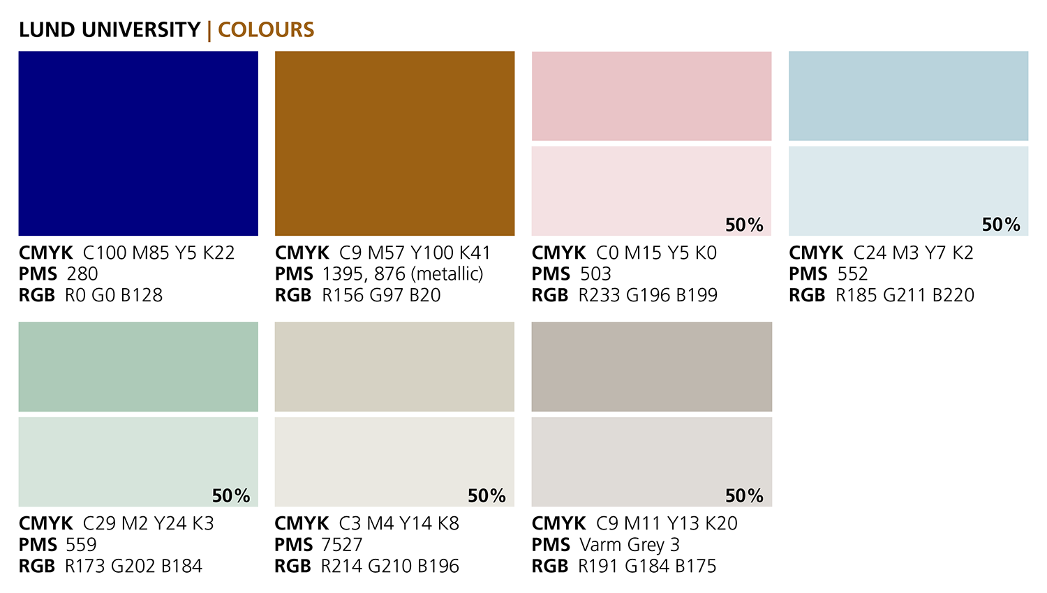
Our profile colours
Two of Lund University’s profile colours, dark blue and bronze, come from our logotype.
Complete overview of Lund University’s profile colours (PDF 59 kB, new window)
The colour codes listed
Dark blue
- CMYK: C100, M85, Y5, K22
- PMS: 280
- RGB: R0 G0 B128
Bronze
- CMYK: C9 M57 Y100 K41
- PMS: 1395, 876 (metallic)
- RGB: R156 G97 B20
Pink
- CMYK: C0 M15 Y5 K0
- PMS: 503
- RGB: R233 G196 B199
Light blue
- CMYK: C24 M3 Y7 K2
- PMS: 552
- RGB: R185 G211 B220
Green
- CMYK: C29 M2 Y24 K3
- PMS: 559
- RGB: R173 G202 B184
Beige
- CMYK: C3 M4 Y14 K8
- PMS: 7527
- RGB: R214 G210 B196
Grey
- CMYK C9 M11 Y13 K20
- PMS Varm Grey 3
- RGB R191 G184 B175
Darker profile colours
The University’s pastel colours (pink, light blue, light green, beige and grey) are also available in slightly darker colour scale – to be used when needed.
Darker shades of the University's profile colours (PDF, 74 kB, new window)
If you are working in the Adobe package, there is a colour file (ASE file) with these darker swatches available, which you can install in your programme. If you need lighter shades, use the normal profile colours and their shades at 50 per cent.
Colour file and instructions (Zip-file, 573 kB, new window)
NCS colours
The NCS system (Natural Colour System) is used for signage, paintwork and some merchandise:
- Dark blue: S 4550-R70B
- Bronze: S 4050-Y20R
- Pink: S 1015-R20B
- Light blue: S 1515-B20G
- Green: S 1020-G10/
- Beige: S 2005-Y
- Grey: S 2502-R
The various colour systems
RGB is colour in the form of added light, and stands for Red, Green and Blue. You experience RGB colours on all sorts of screens and they are therefore the standard in programs for screen presentations such as PowerPoint. If you are creating a banner or similar for the web, you should always use RGB.
CMYK are the most common print colours and stand for Cyan, Magenta, Yellow and Key-colour (black). All colour which is printed out by a colour printer or printed from a press is obtained using CMYK (unless you have chosen to print a spot colour).
Pantone (Pantone Matching System, often referred to as PMS) is the most common spot colour system for printing. Pantone colours are mainly used for one- or two-colour printing when a precise colour match is desired, for example when printing office material, and they offer the possibility of printing colours which cannot be obtained using CMYK, such as fluorescent and metallic colours.
NCS = Natural Colour System. Provides the correct colour values for things like signage, paintwork and some profile products.
How to use the colours
The pastel colours are the colours that are to be most visible and most used. Bronze complements and dark blue is to be the least prevalent colour, used almost exclusively in the logotype, in some digital systems and on signage.
White is a large part of our colour profile and is to be used for example in heading spaces and frames, as font colour and above all through plenty of space in the layout. Remember to work images into your layout where possible, and do not let the colours take up too much space. It is the combination of our colours, our image style, and the white/empty spaces which give Lund University a unique visual identity.

Text colours
Bronze, dark grey, black and white (negative) are approved text colours.
Read more about how to use the profile colours in text
How to manage the colours for print
For printing at Media-Tryck, you should submit material in Pantone (PMS) with images in RGB. This is because Media-Tryck’s colour management system converts all colours according to the printer and paper that are to be used.
Colour codes for websites and apps
For further information on the application of the graphic profile on the web, see the University’s web templates.
Graphic Profile for online presence and apps
Colours on websites
For information on the application of the graphic profile on websites, please see Lund University’s style guide in which you can see examples of different page types, design components and html code.
Contact
Corporate Communications
grafiskprofil [at] kommunikation [dot] lu [dot] se
Petra Francke
Communications officer
petra [dot] francke [at] kommunikation [dot] lu [dot] se (petra[dot]francke[at]kommunikation[dot]lu[dot]se)
+46 46 222 03 16
Maria Wendel
Communications officer
maria [dot] wendel [at] kommunikation [dot] lu [dot] se
+46 46 222 70 07